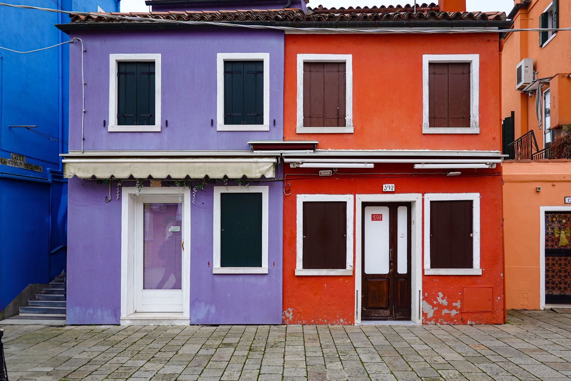
Understanding the Impact of House Colours on Curb Appeal
Why Colour Choice Matters
The colours you choose for your home’s exterior are among the first things visitors and passersby notice. A well-selected colour scheme enhances your home's architectural features, highlights its best aspects, and creates an inviting atmosphere. Beyond aesthetics, the right colours can significantly boost your home's curb appeal, making it more attractive to potential buyers or simply elevating your pride in ownership.
Psychology of Colours in Home Design
Colours evoke emotions and perceptions. For example, soft blues and greens often convey tranquility and harmony, while reds and yellows can evoke warmth and energy. Understanding the psychological impact of different hues allows you to set the mood you want for your home’s exterior. Choosing colours that resonate with you and your lifestyle can transform your house into a welcoming retreat.
Assessing Your Home’s Architecture and Setting
Matching Colours to Architectural Style
Every architectural style has colour palettes that complement its design. For instance, Victorian homes often suit rich, bold colours with contrasting trims, while modern or minimalist homes benefit from sleek, neutral tones. By aligning your colour choices with your home’s architectural style, you ensure a cohesive and authentic appearance that enhances its character.
Considering Neighborhood and Environment
Take note of the surrounding environment and neighborhood aesthetics. A colour that stands out too sharply might clash with neighboring homes, while one that blends too much might make your property less noticeable. Additionally, consider natural elements—such as the greenery around your home or local weather patterns—that influence how colours appear and age over time.
Choosing a Colour Palette That Lasts
Selecting Base, Trim, and Accent Colours
A well-balanced palette typically includes a base colour, trim colour, and accent tones. The base colour sets the overall mood, the trim highlights architectural details like window frames and eaves, and accents add personality to doors, shutters, or other smaller features. Choosing these elements thoughtfully creates depth and interest without overwhelming the eye.
Balancing Bold and Neutral Tones
Neutral colours, such as beiges, greys, and soft whites, provide timeless appeal and flexibility. Pairing these with bold colours—used sparingly—can create striking contrasts that draw attention to key features. For example, a charcoal base with a bright red door adds vibrancy without dominating the facade. Striking the right balance ensures your home remains stylish for years.
Testing Colours Before Committing
Using Sample Paints Effectively
Before painting your entire house, try applying sample patches of your chosen colours on different exterior walls. This hands-on approach reveals how the paint interacts with your home’s surface texture and existing elements. It’s also an opportunity to see how easy the colour is to work with and whether it meets your expectations up close.
Evaluating Colours in Different Lighting
Colours can shift dramatically depending on lighting conditions throughout the day. A shade that looks perfect in the morning sun might feel too dark or dull in the evening. Observe your samples at various times—bright daylight, cloudy skies, and dusk—to ensure the colour maintains its appeal regardless of lighting changes.